How Ad Spending Aligns With Media Consumption

An old advertising adage says that “money follows eyeballs”, meaning that advertising spending will follow wherever consumers focus their attention or spend their time. If this were true, advertising revenue broken down by medium should roughly align with the average time people spend using different media. But is that really the case?

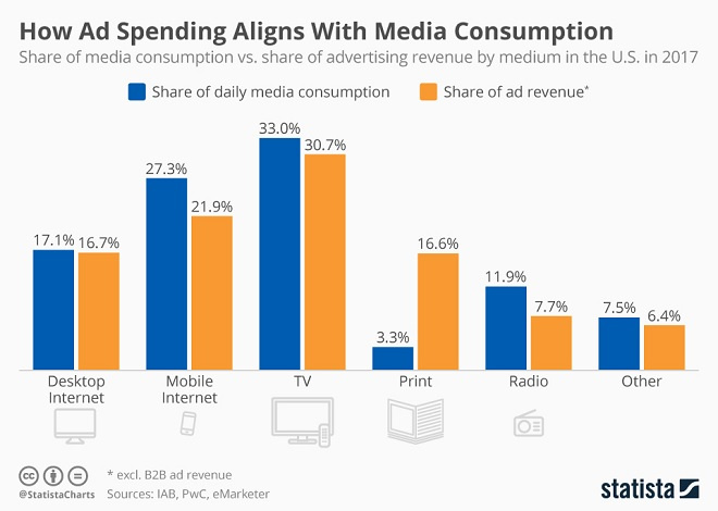
Comparing U.S. ad revenue figures published by the Interactive Advertising Bureau (IAB) to daily media consumption estimates by eMarketer, the following chart shows that both indicators do indeed correlate. In 2017, U.S. consumers spent the most time watching TV and using mobile devices, which is also where the lion’s share of advertising dollars went. There is one notable exception to the rule though: print media, which receives more ad dollars than it should based on how much (or little for that matter) time people spend reading newspapers and magazines.

Does this mean that print publishers should fear a further decrease in ad revenues? Not necessarily. While people may not spend as much time reading as they used to, print advertising is still one of the most trusted and thus effective forms of advertising, which is why brands continue to assign a seemingly disproportionately large share of their ad budgets to print media.

Media Infographic

Snapchat Re-Design – The Details in 60 Seconds

It’s not exactly a secret; Facebook is now being labeled the “old” people social network while Snapchat is for the “kids” (see “Snapchat Cements Its Must-Have Status Among U.S. Teens“).

But we are a fickle bunch and Snapchat, it seems, knows that. Here are very brief details on how they intend to keep the youth of today hooked. For more click here.

The Smartphone’s Victims

As the mobile industry is gathering in Barcelona this week to show off the latest trends in smartphone technology, it’s time to spare a thought for those devices that have fallen victim to the smartphone’s unstoppable rise.

Ten years ago – the iPhone had just been unveiled but was yet to be unleashed on the world – we used to rely on a variety of devices to help us complete different tasks. Most of us had a mobile phone to text and make calls, an MP3 player to listen to music, a digital camera to take vacation pictures and a navigation system to help us find our vacation home in the first place. What a difference ten years make. These days, we only need one device to do all of the above and sales of non-smartphone gadgets have subsequently plummeted.

The below chart, based on data from the Consumer Electronics Association, shows how far sales of devices with more limited functionalities have dropped at the hand of smartphones and their many talents.

This chart shows how electronic devices sales have changed since the smartphone boom started 10 years ago.

Infographic: The Smartphone's Victims | Statista You will find more statistics at Statista